
Welcome to WordPress. This is your first post. Edit or delete it, then start writing!
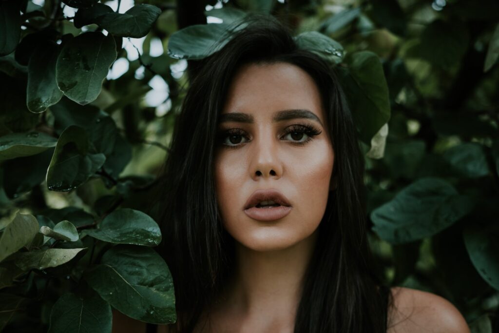
Photography is more than just capturing a moment — it’s about evoking emotion, telling stories, and creating visual harmony. One of the most powerful tools a photographer can use to enhance their visual storytelling is color theory. Whether you’re shooting portraits, landscapes, fashion, or abstract art, understanding how colors interact, contrast, and complement each other can transform your images from ordinary to extraordinary.
In this blog, we’ll explore the foundations of color theory, how it applies to photography, and practical ways to use it creatively in your work.
Color theory is the science and art of using color. It explains how humans perceive color, how colors mix, and how certain combinations can affect mood and emotion. At its core is the color wheel, a circular chart developed by Isaac Newton, which categorizes primary, secondary, and tertiary colors.
These are the base colors and cannot be made by mixing other colors.
Created by mixing two primary colors.
Made by combining a primary with a secondary color.
Understanding this wheel allows photographers to balance and control the mood of an image through intentional color choices.
To use color theory effectively, photographers often apply different color harmony schemes. These schemes help guide the eye, create cohesion, and evoke emotion.
Complementary colors are those that sit directly opposite each other on the color wheel, such as red and green or blue and orange. When used together in photography, they create a strong contrast that adds drama and vibrancy to the composition. This striking opposition can draw immediate attention to the subject and make the image feel more dynamic.
Analogous colors are those that sit next to each other on the color wheel, such as blue, blue-green, and green. These colors naturally blend well together, creating a calm and harmonious feeling within a photograph. Because they share similar tones, analogous color schemes are pleasing to the eye and evoke a sense of balance and unity.
Triadic colors are three colors that are equally spaced around the color wheel, such as red, yellow, and blue. This combination creates a balanced yet vibrant feel, bringing energy and liveliness to a photograph without letting any single hue dominate the scene. When used skillfully, triadic color schemes add depth and visual interest while maintaining harmony.
Monochromatic colors refer to variations of a single hue, ranging from its lightest to darkest shades. This approach creates an elegant, clean, and often emotionally powerful effect, emphasizing tone, texture, and composition over color contrast. By focusing on one color family, photographers can evoke strong moods and visual cohesion within an image.
Colors are not just visual elements; they carry emotional weight and psychological influence. Each color can trigger a specific feeling or reaction, making them powerful storytelling tools in photography. By understanding the emotional associations of colors, photographers can create deeper meaning and mood within their images.
For example, red often evokes passion, energy, or danger, making it an ideal choice for dynamic street scenes, bold fashion shoots, or striking product photography. Blue, on the other hand, conveys calmness, trust, or even melancholy, which suits tranquil landscapes or contemplative portraits. Yellow is associated with joy, warmth, and sometimes caution, and it brings a cheerful tone to nature or lifestyle images.
Green symbolizes growth, renewal, and health, making it a natural fit for outdoor photography and wellness-focused visuals. Black embodies power, mystery, and elegance: perfect for high-fashion or editorial-style photography. White, representing purity, simplicity, and peace, works beautifully in minimalist compositions and wedding photography.
By selecting a color palette intentionally, photographers can guide emotional responses and create a cohesive story within a frame.
Just be careful, too much editing can make colors look unnatural or overdone.
Nature is a master of color harmony. Sunrise and sunset scenes are rich in warm tones, while ocean and mountain scenes are filled with cool blues and greens. Train your eye to observe color relationships in the wild.
Color theory works best when balanced with good composition. Think of color as another compositional element like lines or shapes. A balanced image uses both form and color to create visual interest.
Portrait Photography:
In portrait photography, color contrast between the subject’s clothing and the background can significantly enhance the image. By choosing complementary or contrasting tones, a photographer can draw more attention to facial features and expressions. This technique not only adds visual interest but also guides the viewer’s focus to the subject’s eyes or emotions.
Product Photography:
Product photography relies heavily on strategic color choices to attract attention and convey brand identity. Using a complementary background color helps the product stand out, making it the focal point of the image. This is especially effective in advertisements, where grabbing viewer attention in a split second is crucial.
Street Photography:
Street photography thrives on spontaneity, and color plays a vital role in adding character to candid moments. Capturing unexpected color juxtapositions, like a bright yellow cab cutting through a dull gray alley — can turn an ordinary scene into something striking and memorable.
Travel Photography:
In travel photography, color helps convey the cultural essence and unique spirit of a location. Different regions are characterized by distinct color palettes — think of the vibrant hues of Indian saris, the deep blues of Greece’s coastal towns, or the warm tones of Moroccan markets.
The best way to understand color theory in photography is to experiment. Here are a few challenges:
As you experiment, you’ll learn how color affects tone, emotion, and structure.
Color is a silent language in photography. With the right color choices, you can make viewers feel joy, sadness, warmth, or tension — often without them knowing why. Whether you’re just starting or looking to deepen your visual storytelling, mastering color theory helps you become not just a photographer, but an artist.
So next time you pick up your camera, don’t just look for the light or the subject, look for the color. Let it guide you. Let it inspire you. And most importantly, let it speak for you.
Plot No. 22 and 23, 2nd Floor, 2nd Main Road, V.G.P. Selva Nagar, Velachery, Chennai – 600042. TN, IN

Plot No. 22 and 23, 2nd Floor, 2nd Main Road, V.G.P. Selva Nagar, Velachery, Chennai – 600042. TN, IN